Estimated read time: 5-6 minutes
- The Utah 2034 Olympic logo, unveiled at Salt Lake City Airport, faced criticism.
- Designer Molly Mazzolini explains the logo's elements, inspired by Utah landmarks and culture.
- The black and white design aids visually impaired athletes; a permanent logo debuts in 2029.
SALT LAKE CITY — In a moment inside the Salt Lake City International Airport last week, a crowd gathered to witness the unveiling of the Utah 2034 Olympic and Paralympic branding and logo. Cheers echoed in the airport foyer.
Online, however, the reaction was different.
Images of the logo quickly spread across social media and message boards, where many people voiced frustration, confusion or flat-out distaste for the branding.
Many comments said the wordmark, or font, of the logo was difficult to read.
Others felt it didn't represent the feeling of the Olympics.
Many questioned the look of the logo.
But according to Molly Mazzolini, the creative designer behind the Utah 2034 branding, there is more meaning in the design than many people might notice at first.
"Designing a logo is, it's so much more than a logo," Mazzolini said. "You want to ensure that there is meaning with a design, and you are representing so many voices."
She said she has seen plenty of online comments, both critical and supportive, and knew going with what she called a "bold design" often brings out strong opinions.
"When you launch something as big and creative as this, it is open to people's opinions. So, you see the subjective side of what people initially think, and what we have found is that the more you know about the meaning of the design, the more you connect with it," she said.
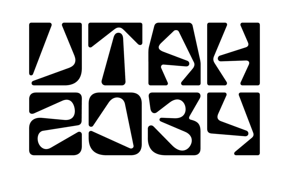
There is a lot of meaning within the Utah 2034 logo.
According to Mazzolini, she and her team spent a lot of time trying to unify and represent as many parts of Utah as possible:
- The "A" in "Utah" is shaped after Delicate Arch, one of the state's most recognizable landmarks.
- The curve inside the zero draws from petroglyph and pictograph designs found throughout Utah's ancient rock art.
- The angle in the "4" is inspired by a bend in a mountain road, a nod to Utah's canyons and outdoor recreation.
- The "3" is meant to represent Reflection Canyon, a popular spot on Lake Powell.
- The stacking and spacing of the Utah 2034 logo itself is drawn from the grid system many Utah cities and towns use.

However, many comments online argued that if you have to explain a logo, it might not hit the mark.
"As a creative professional, it's important to take note of the subjective comments," she said. "But we also have to step back and look at the design from a neutral perspective. That's how we deliver our best work."
Mazzolini has helped create branding and logos for NFL Super Bowls, NCAA college football playoffs, and several venues where large sporting and entertainment events have taken place.

She has seen similar reactions from many logos and branding in the past, both hers and other designers, and feels it's natural for an event as large as the Olympics to have such a strong reaction.
"That's the beauty of this, and it is very common to see this for logo launches, whether it's Olympic or sport or entertainment or a brand in of itself," Mazzolini said.
Another aspect of the logo many commenters criticized is the black and white coloring.
Mazzolini explained the colors come from the Paralympic movement, where high-contrast visuals help athletes with visual impairments navigate competition spaces.
"We had meetings with Paralympic representatives," she said. "They educated us on how to make the logo better for all."
It's also important to note this logo isn't permanent.
Because Los Angeles 2028 holds the rights to all U.S. Olympic and Paralympic branding and marketing until its Games conclude, Utah is currently allowed to use only a transitional logo.
The use of a transitional logo is a relatively new concept allowed by the International Olympic and Paralympic Committee, especially with Utah winning the 2034 bid in the summer of 2024, almost 10 years before the Opening Ceremony.
That means the design unveiled last week is temporary, kind of a placeholder, so Utah has an identity while planning and public engagement move forward.
"It is very important that we represent according to the guidelines that they give to us and that they have also approved of what we call a transition logo, because we are just starting as an organizing committee," Mazzolini said. "We are guardians of these beautiful marks, the Olympic rings, the Paralympic agitos, on behalf of the International Olympic Committee and International Paralympic Committee."
A finalized Utah 2034 logo and branding, with color, will be released in 2029, after LA28 officially passes the torch.
There might also be a new design with the permanent logo.
"We have a slow and steady role to evolve the look of Utah 2034," she said.
Mazzolini also says she understands the reactions and isn't discouraged by them. She said she views the conversation as part of the creative process and is excited to try and represent so many different regions of Utah.
While picking up family members for the Thanksgiving holiday, Mazzolini said she noticed a lot of people taking pictures of themselves in front of the artwork near security at the airport.
She said she's noticed an awe particularly in the younger generation, who weren't alive during the excitement of the Salt Lake City 2002 Winter Olympics and Paralympics.
"I was giving out stickers to the kids, and it was so beautiful to see everyone had these moments. These are the type of moments we want for everybody to interact with," she said. "It really is important that people want to connect with it and make it their own, and that was one of the key brand objectives in working and developing the Utah 2034 wordmark."
The transitional logo will continue appearing at public events, the airport and Utah 2034 committee meetings.
Merchandise featuring the design is already available at several Utah Olympic venues.
And judging by the online conversations so far, the discussion around the logo is likely far from over.