Estimated read time: 6-7 minutes
This archived news story is available only for your personal, non-commercial use. Information in the story may be outdated or superseded by additional information. Reading or replaying the story in its archived form does not constitute a republication of the story.
Designers have crafted ideas submitted by Utahns into 20 "flag-worthy" designs for a new Utah State Flag. Now it's time for the public to weigh in on the designs by taking this survey: flag.utah.gov/final-flag-designs.
The designs, released as part of the More Than A Flag project, offer the next strands in a larger conversation about Utah's shared values. These are illustrated in themes and symbols submitted by Utah residents in every county in the state. The aim is that by the end of the year the Utah Legislature will adopt a new flag design that will be embraced as "the people's flag."
To outline the public design process that led to the selections of these semi-final designs, we interviewed Sarina V. Ehrgott, the director of marketing and brand for the Utah Department of Cultural & Community Engagement, leaders on the Design Review Subcommittee; and Gareth Fry, assistant professor of graphic design at Utah Valley University.
So tell us: How did the process of paring down 5,703 submitted flag designs — and more than 1,500 themes and ideas — happen?
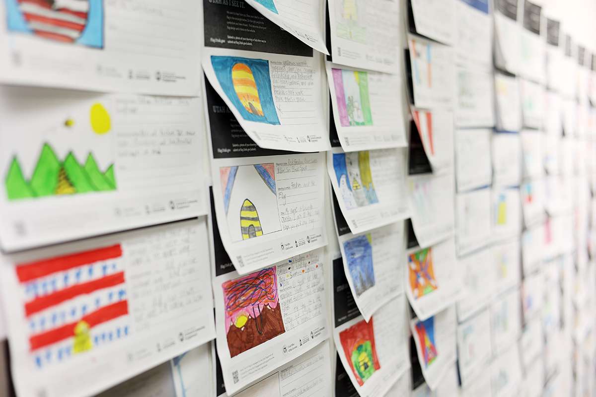
SARINA EHRGOTT: First, our internal team posted thousands and thousands of the designs on the wall in our office building, so the Design Review Subcommittee could see the flag designs and the breadth of ideas they suggested. Anyone on the committee could pull a design off the wall and advance it to the next round – one person's vote was all it took.
What happened next?
Then we culled it down, first to several hundred, then to eighty. We grouped the designs into themes and concepts — for example, one group foregrounded beehives, for the state's slogan as the beehive state. Additionally there were designs that emphasized values, such as unity, and the state's mountain landscapes, or representations of arches.
And then?
Next we worked with flag artists to draw upon the inspiration of the submissions and the text surveys to refine those ideas into what you see now, 'flag-worthy' designs. We also considered the color schemes that Utahns' suggested most often. Now we're in the public feedback phase.
Some posts on Twitter suggest many of the semi-final designs look similar. What does that comment suggest to you?
I've been really impressed and dedicated to the process. Across the more than 5,703 submitted designs and additional thematic suggestions, a handful of colors and symbols seem to have really resonated with Utahns. This built a visual language, which has impacted many of the final designs.

For example?
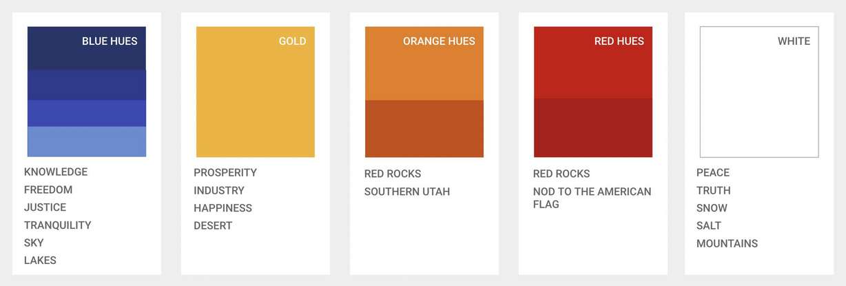
We talk about those colors and their symbolism here. For example, blue represents our lakes and wide open sky, as well as optimism and justice. Gold represents industry and prosperity. Red and orange represent our state's red-rock landscape and strength, and white represents our snow-topped mountains as well as values like peace and truth. From an entire rainbow of colors, these are what Utahns say represent Utah. These are our colors.
From an entire rainbow of colors, these are what Utahns say represent Utah. These are our colors.
–Sarina Ergott, director of marketing and brand for the Utah Department of Cultural & Community Engagement
That idea: 'of representing Utah.' How do you want Utahns to consider representation when it comes to flag designs?
Maybe one flag design doesn't need to represent each community individually — but there's an opportunity to express our commonalities through shared landscapes or values. In the end, the iconography and colors should encapsulate people now and have reverence for our state's history, while looking toward our future aspirations.
Next steps?
After the public feedback deadline on Oct. 5, the Design Review Subcommittee will consider all the comments at their next meeting. They will pass forward three or four designs to the Utah State Flag Task Force. And then in early winter, Gov. Spencer and Lt. Gov. Deidre Henderson will recommend one flag to the Utah Legislature for adoption.
Now let's hear more about the design: What was surprising about the review process?
GARETH FRY: There were some 25 people in the early committee meetings looking at the more than 5,700 submissions, most of them not designers. They brought a wide variety of opinions, and some made a case for submissions where the underlying ideas were strong, but the execution was failing a bit. As a designer, I initially felt justified to ignore those options, but as the committee members made a case for them, I started to think there was something there. Some of those submissions even made it through to the final refinements process.
Tell us more about the refinement phase.
Our role was not necessarily to stick hard-and-fast to the original submissions but, where appropriate, to take inspiration from those designs without drifting into creating our own. At this point, we were working with a small group of designers. We took inspiration from the designs, and then we combined core ideas with design and branding best practices, including things such as keeping the design as simple as possible and making it as reproducible in as many mediums as possible.

An example?
We kept the core concepts in mind, including what the submitter wrote, to use their ideas as a guide. For example, one of the semi-finalists is fairly similar to a submitted design, which depicted a flag divided into three segments with diagonal lines emanating from the bottom left-hand corner. What the submitter wrote didn't actually fit the design they had created – the design didn't show three equal geometric elements for Utah's regions: the Colorado Plateau, the Great Basin and the Rocky Mountains. What evolved from that is another design that also made it into the short list. It had a similar feel to it, but with more defined geographic shapes and colors clearly identifiable in the design.
Not just on flag design, but any design process, designers often feel like part of their job to one degree or another is to look into the future to see what could be done differently or better. That's instead of just reproducing and perpetuating what's been done in the past.
–Gareth Fry, assistant professor of graphic design at Utah Valley University
What do you hope the public and students might learn about this public design process?
I would hope they might appreciate that we not only wanted to update the design of the current flag to give Utah something more simple and inclusive, but we might also broaden preconceived notions of what a flag ought to look like. That's so our new flag might stand the test of time and perhaps even be a design other states (and maybe countries, too) would envy.
This reminds me of a story about Henry Ford, whose 1908 Ford Model T was named the most influential car of the 20th-century. Ford said: "If I had asked people what they wanted, they would have said: 'Faster horses.'"
My point is: Not just on flag design, but any design process, designers often feel like part of their job to one degree or another is to look into the future to see what could be done differently or better. That's instead of just reproducing and perpetuating what's been done in the past.
Register your opinion of the semi-final flag designs here. Find out more about the public design process here.


