Estimated read time: 8-9 minutes
SALT LAKE CITY — John Stockton didn't want change.
As he saw it, the Utah Jazz didn't need an update. The New York Yankees wouldn't abandon pinstripes, the Los Angeles Lakers wouldn't change their logo, the Chicago Bulls wouldn't suddenly wear blue.
So why should the Jazz rebrand?
He wasn't alone in that thought. When the Jazz unveiled a new purple and light blue mountain design ahead of the 1996-97 season, the overwhelming reaction was … why?
Nearly three decades later, a similar rebrand is being nearly unanimously praised. It's funny how things change.
"I will tell you this to my dying day, no one knew this would ever be popular — any of this stuff — 30 years ago," said Tom O'Grady, who designed the Jazz's original mountain jerseys (along with nearly every other NBA jersey in the 1990s).
"It wasn't part of pop culture. There was no Mitchell and Ness. There was none of this incubator for nostalgia — we were just trying to do our best design work. Can you see the numbers from a distance? Check. Do they fit right? Check. You were just doing uniform designs. You weren't worrying about what was going to happen in 20 years."
He may not have intended for things to become nostalgic, but that's just what happened. As the NBA morphed into a more simplistic and minimalist age — with the Jazz (both in 2004 and again in 2022) being among the worst offenders — some fans have yearned for the bold, colorful, and sometimes a bit absurd looks prevalent in the 1990s.
In recent years, the Toronto Raptors, Detroit Pistons, and Memphis Grizzlies have brought their colorful '90s looks back as alternate jerseys. And last season, the Phoenix Suns unveiled a modernized version of the sunburst look worn by Charles Barkley in the 1993 Finals.
The Jazz are now following suit.
The team announced last week it was returning to a mountain look inspired by the original late-1990s classics. O'Grady wasn't involved in the desgins this time, but he said it's been validating to see the fans' reaction to the mountains returning.
"It's cool that it's been this overwhelming acceptance of that, and I understand that the other thing is bad (Utah's widely panned yellow and black look)," O'Grady said. "But to whoever designed those deserve credit, it's a nice update. It is a nice update to what they had back in '96."
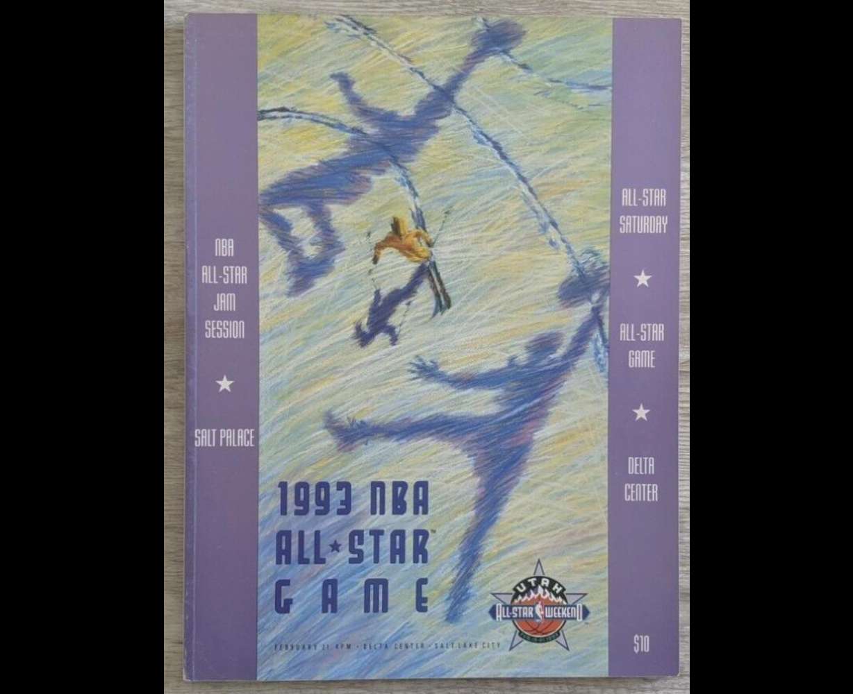
As O'Grady spoke to KSL.com about the design, he wore a 1993 NBA All-Star Game hat; that was an intentional choice. The premise of Utah's radical rebrand came from that All-Star Game's design; that's easy to see. The mountains are the same, and the font is even similar to what ended up being the Jazz's new logo.
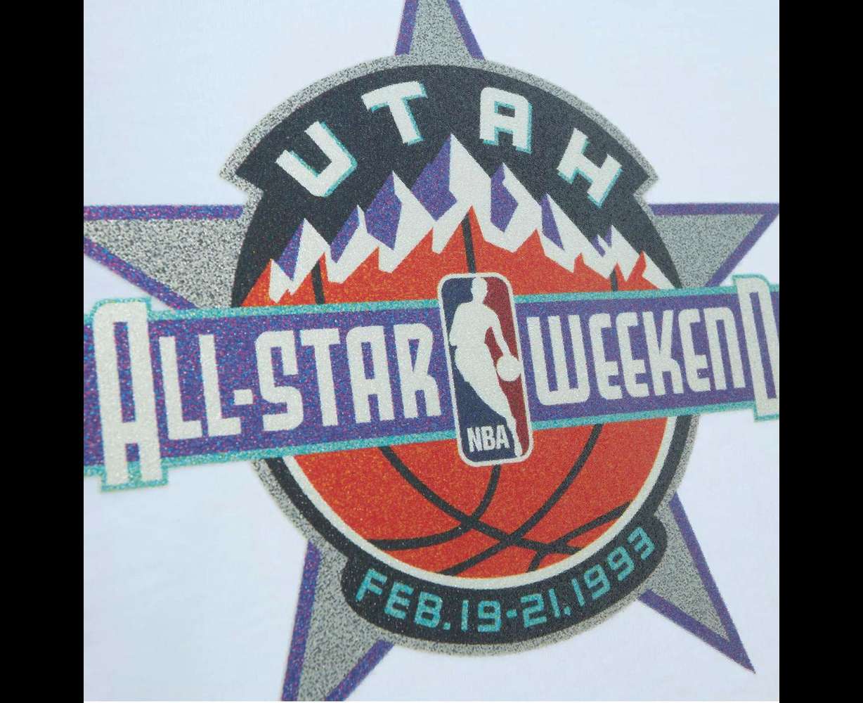
"If you look at the poster for the All-Star Game, and if you look at the program cover, the colors are in there — you can see the new light blue. We were trying to capture the essence of the Wasatch Mountains. When that bright blue sun hits those slopes, it turns into a beautiful color," O'Grady said.
After the reception for the All-Star Game and logo, then-Jazz marketing executive Jay Francis had an idea: Maybe this was a way to move away from the New Orleans era.
Jazz branding has been tricky since it moved to Utah. The J-Note logo and Mardi Gras colors that had worked so well in New Orleans didn't really fit with Salt Lake City. But once Stockton, Karl Malone, and Jerry Sloan turned the team into a perennial winner, the name started to resonate more and more.
The name wasn't going to change. The colors? That was a different story.
"That was definitely in the creative brief. 'We want to move away from the Jazz Mardi Gras colors now because we still feel like that belongs to New Orleans. We've adopted it as our colors, but it's never felt proprietary to our team,'" O'Grady remembered.
Utah wanted something that felt, well, more Utah.
So O'Grady went with a more winter-like light blue, and the copper was inspired by him looking down at the Bingham Canyon Mine on his way back from the All-Star Game.
"That was kind of the reference point," he said. "Today it'd be like a 15-second hype video about storytelling and all that BS, but I was just looking for a good color."
When designing the new Jazz wordmark — a wordmark that stuck around through various rebrands — he said he wanted it to appear like it was sliding down the mountain. That was another homage to the All-Star marketing materials.
"If somebody said, 'What's your key inspiration for the uniform?' I'd say this logo," he said, pointing to his hat. "That artwork was really kind of what we used, and we just kind of picked it apart and then repurposed it in kind of the more traditional sports uniform design."
Though he's surprised they let him go as crazy as he did.
"On a scale of one to 10, the Jazz are probably a nine," O'Grady said. "They're right there. They don't have a red dinosaur running around on the front of their jersey, but everything else is pretty intense."
After all these years, he still loves the purple uniform — "the purple mountain majesties" as he calls them — but still thinks something was missing with the white uniform.
"Even 30 years later, you question yourself, what else would we put there color-wise to give a little bit more base to the white?" O'Grady said. "The only other thing I think we could have done is maybe put the light blue above the mountains to capture the mountain more, but that might even be schlocky."
The final piece of the rebrand came a couple of seasons later with a black alternate jersey that didn't have mountains. That jersey heavily impacted the league's designs for a decade.
O'Grady remembers presenting the new black jersey to a group that included NBA commissioner David Stern and deputy commissioner Russ Granik.
Granik, who O'Grady remembers as usually pretty quiet in these meetings, took one look at the jersey and bluntly said: "The Jazz are not a black uniform team."
"It was like somebody just came and punched me in the side of my head because he never would say anything about any design," O'Grady said. "If it was David, I'd be fine because David's gonna beat the (expletive) out of everybody, but it was Russ that was speaking up."
Stern said: "O'Grady, I want to know how many black alternates or regular black uniforms we have in the league now."
O'Grady started to think of the Bulls, the Sacramento Kings, the Philadelphia 76ers, the Miami Heat … the number was adding up.
"Two days ago," Stern began, "I was at ESPN Zone here in New York and I'm watching ESPN from a distance, and I'm watching a black uniform team against a white team. And another black uniform team against a white team. I didn't know who I was watching from a distance anymore."
At that point, O'Grady was starting to sweat a bit.
"How can a team be wearing black when they don't even have black in their logo?" Granik said.
"Well, it's a trend, and it's what the Jazz wanted," O'Grady responded, not completely sure how things were going to end up.
Stern gave the final approval, but with a strong caveat.
"You can tell Jay he's going to get his black (expletive) uniform and no one will know who the hell they are," Stern said. "But this is it! There are no more black uniforms. … There's going to be a moratorium on black, and I'm going to get it to the Board of Governors, and we're going to vote on it, and we're going to put it in the operations manual."
It would be years until the next black uniform was released.
Oh, how things have changed.
It's a different world now with new designs being thought up every year — and just about every team using a black jersey. But the Jazz's new brand brought some validation to O'Grady.
He first felt it in 2019 when the team brought the mountains back as a classic jersey and saw the fan reaction. He felt it again last week when he saw those familiar mountains on a jersey again. And he sees shades of his design elsewhere in the state, too.
"You guys just went through a flag rebrand, right?" he said. "In some weird sort of way, the Jazz mountains are in the flag. It's a different interpretation, but it's our Jazz mountaintop."
The new Jazz uniforms have a different interpretation of the mountains, as well — mountains that were once unwanted but have now been enthusiastically welcomed back.
"I'm glad that they modernized it. I would have modernized what I did in 1996, as well," O'Grady said. "You can't stick with it forever, but at the end of the day, it's nice to see that it inspired the new look, and the fans are very happy."